Is your bounce rate too high? Do you want to reduce your bounce rate? In this article, we will share 10 proven methods to reduce your bounce rate and increase your conversions.
A high bounce rate is one of the most common conversion killers. If the majority of your users leave your website on the first page, you do not have the possibility to convert them to subscribers or customers.
Let’s take a look at what the bounce rate is and how you can lower it.
What is the bounce rate?
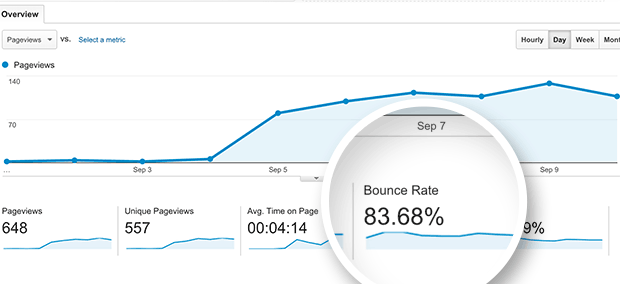
The bounce rate is the percentage of users who visit your site and decide to leave without going to a second page.
A higher bounce rate indicates that you were unable to convince the user to stay and act on your call to action (i.e. buy your product).
A visitor can exit your site by clicking a link to a different site, clicking the back button to exit your site, closing the open window/tab, entering a new URL, or due to session timeout (caused by web hosting errors).
You’re probably thinking that this is just normal user behavior, right? Yes it is, but there is a good bounce rate vsa bad bounce rate.
Let’s take a look at the industry benchmark average bounce rate and determine what a good bounce rate is.
Average Bounce Rate by Industry + What’s a Good Bounce Rate?
You might be wondering what a good bounce rate is. Well, the general rule is that:
- 80% + is very bad
- 70 – 80% is bad
- 50 – 70% is the average
- 30 – 50% is excellent
- 20% or less is likely a tracking error (due to duplicate analytic code, improper implementation of event tracking, third-party plugins, such as live chat plugins).
While the above metrics are good to start with, the bounce rate varies by industries and the type of content you have.
Take a look at the graph below to see an average bounce rate by industry:
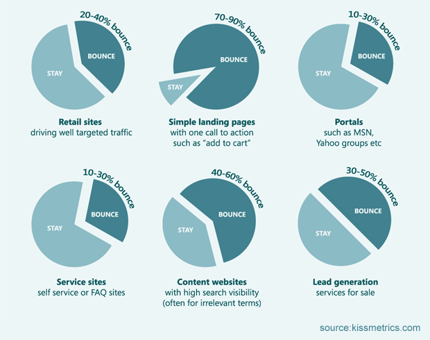
If you have an above-average bounce rate, this can be due to one of several reasons, such as slow load times, poor navigation, poor design, poor usability, lack of a clear call to action, etc.
Let’s take a look at how to improve your bounce rate.
How to Reduce Your Bounce Rate
Identifying and fixing problems with your landing pages can easily fix your high bounce rate problem. We’ll show you some of the most common higher bounce rate mistakes and how to fix them.
Before you begin, it’s a good idea to identify the top pages with the highest bounce rate. You can do this by going to Google Analytics and clicking on Behavior »Site Content» Landing Pages
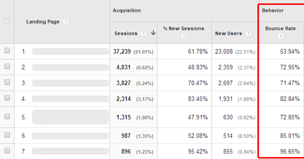
Knowing the first few pages will help you identify problem areas and correct them.
Provide a Better Overall User Experience

Neilsen Norman Group, the leading usability research consultancy, defines user experience as:
The “user experience” covers all aspects of the end user’s interaction with the company, its services and its products.
User experience is the general feeling of a user interacting with your site. A good user experience is when the user finds a site not only easy to use, but also pleasant.
Creating a usable website that looks the same on all platforms and devices is the first step in that direction. Look closely at how your users behave and what influences their decisions.
In this article, you will find many other tips that all fall under the user experience. Remember that it is an overall feeling a user experience when using your site, so it is all part of the user experience.
Optimize Your Call of Action Placement
Most users decide whether or not they like a website in the first few seconds. Often it is enough to just look at the visible area without scrolling. This area differs from device to device.
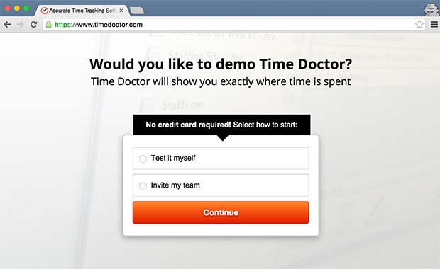
Now that you know what your users are looking for, you can optimize that area. It should immediately describe what you are selling and there should be a clear call to action.
Make your call to action clear and honest. Deceptive users will create a bad user experience, which is the number one reason for high bounce rates and low conversions.
Improve Your Site’s Speed
As we mentioned earlier, users decide on a website in the first few seconds. You don’t want to waste time showing them a blank page loading scripts and downloading content.
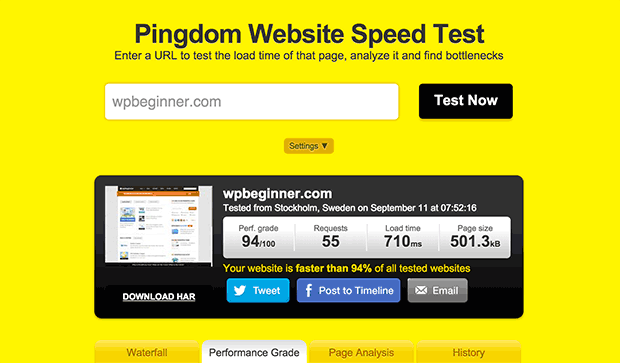
With tools like Pingdom and Google Page Speed, you can optimize all the landing pages on your website.
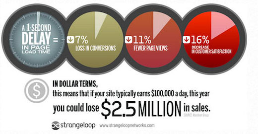
According to Strangeloop, a one-second delay can cost 7% of sales, 11% fewer page views, and a 16% reduction in customer satisfaction.
To speed up your site, you should optimize your images, use a content distribution network, add better caching, and consider switching to a faster hosting provider.
One of the fastest and easiest ways to keep your website responsive is by using a CDN.
Use High-Quality Images to Captivate User Attention
Images are another effective tool that you can use to reduce your bounce rate.
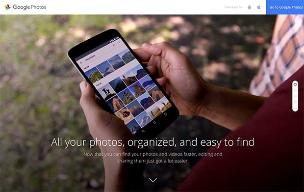
The reason so many sites use high-quality photos as full-screen backgrounds is that they have proven to be very effective. Companies like Google, which were famous for their simple white background and minimalist designs, now use high-quality images on their landing pages.
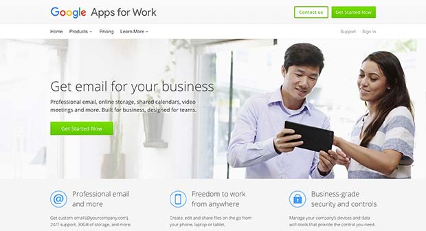
You can buy professional photos from various stock photography websites. There are several sites online that also offer royalty-free images.
You can use these high-quality images as full wallpapers, parallax backgrounds, background slides, or as PiPs alongside your call to action.
Let Your Customers Speak for You
You will see on many websites a small testimonial slider, showing one customer quote at a time. As you do the work, you can make it much more effective.
Turn your testimonials into success stories with real narrative elements such as audio, video, illustrations to show your clients. People love success stories and would like to read more.
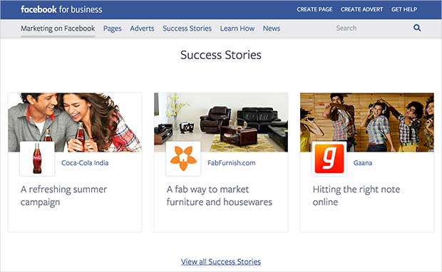
You can also create a testimonial page where all you have is just user testimonials.
Plan a Consistent Content Strategy
While many marketers recommend that you experiment with different content strategies, there is also something to be said for a consistent content plan. How can you achieve these two at the same time?
In fact, they can be, and many successful sites have had them since the 1990s. You need to come up with a content plan that allows you to use different content strategies at the same time.
Take a look at BuzzFeed and see how their content strategy includes a growing list of social content platforms, media and formats. From GIFs to slideshows, from SnapChat to YouTube. If they think their users would find something interesting, they use it.
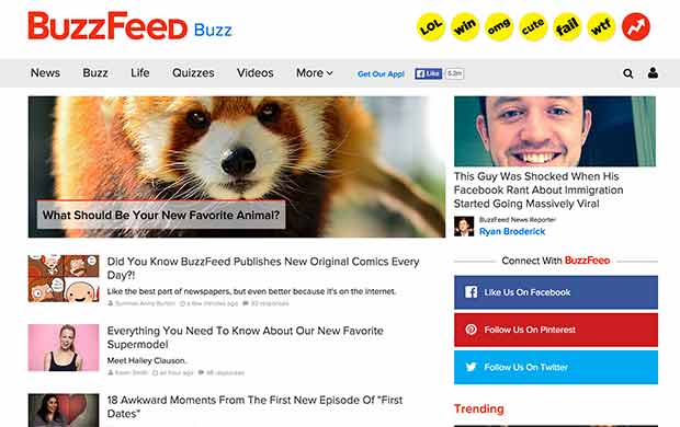
You may not have a business like BuzzFeed, but your goal is exactly the same as Buzzfeed. You want users to stay on your site.
Make Your Site Readable

Most of the content on most sites is in text format. It’s unfortunate that this important part of the user experience of any website is generally the most overlooked. Even on this list, it appeared at number 7.
However, it is one of the most important and crucial elements that can shape the visual appeal of your website.
You need to ensure that the text on your website can be easily read on all devices. It shouldn’t be too small, otherwise users will have to squint or zoom to read it. Use large enough font sizes on smaller screens.
Typography or readability is not limited to the choice of font size and color. You also need to make sure that the text on your website is attractive. There should be enough space between lines, padding, and margins for the text to look clean and beautiful.
Another important point to consider is the language and style that you choose to use on your website. Use easy to understand language in a normal conversational tone.
Show Your Credibility
Consumers are getting smarter every day, this means that they must carefully examine an offer before making a decision. After the initial evaluation of your product, consumers quickly look around to find out how trustworthy your website is.
It is not easy to entrust your money or information to a new company. A new user doesn’t know how good your business is and what kind of reputation you have earned.
Proudly display free reviews of your products or services on third-party websites, such as Product Hunt.
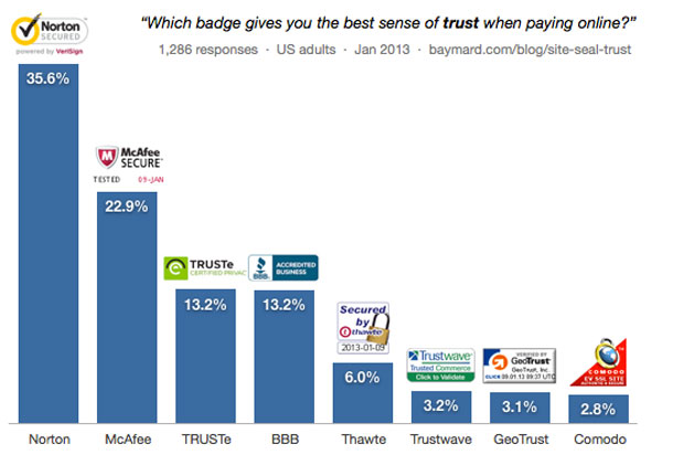
Showcase your industry awards, endorsements, certifications, quality ratings and affiliations. Secure your website and display security seals.
This increases the confidence of the user, so that they feel comfortable distributing their credit card and personal information.
Target Abandoning Users
Despite all your efforts, sometimes a user may want to leave your site. It’s not your fault, maybe something came up in their personal life and they just had to go.
Now you have two options: you can let them go or you can convert them to subscribers.
Most websites only ask for users’ email addresses. It allows them to keep in touch with the user, sending them relevant offers and eventually turning them into paying customers.
You can also show a last minute discount with the exit intent popup. But remember, if a user decides not to take advantage of the offer, they can simply close the window and never come back.
If you combine an exit offer with a registration form, your visitors will have the opportunity to stay in touch.
Target Engaged Users
Often times, your engaged users can also jump in without taking any action. This is very common for blog posts and the resource section.
The user accessed your article, found what they wanted, and left (this is normal).
But it doesn’t help your conversions. In that case, you want to show your users the most relevant offer.
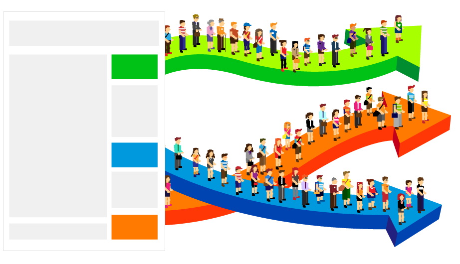
For example, if a user accesses a blog post about cooking, your offering should be a cookbook rather than fashion items.
This will help you reduce your bounce rate, increase engagement, and conversions.
We hope this article has provided you with some good tips to reduce the bounce rate on your site and increase your conversions.
